I'm secretly a ninja...but shhhhh.

Monday, December 3, 2012

Fabric Photo: Daily Create #3


Assignment: Fabric: we wear it, sleep on it, decorate with it. Make a photo of an interesting cloth design or texture. 

Recently I've been trying (and failing) to re-organize my closet/clothes. I learned two things in the process: 
  1. I have WAY to many clothes.
  2. Fabric is interesting (something I'd already known, however I re-visited the topic).
Thus, I took photos of different clothing. Shown here is a portion of a pale pink shirt I have. The colour was washed out when I took this picture, making it seem more grey than pink, but I the effect it adds looks interesting. I enjoy the abstract feeling to it, as there isn't much in this photo that tells you what is being depicted. The texture around the focal point draws the eye in and gives the photograph movement. I also think the shadows produced by the levels looks striking and clean. 
As for the focal point I re-read about the rule of thirds recently, so I tried incorporating parts of that concept as well. Overall this picture was fun and I enjoyed photographing different renditions of it. 

Wednesday, November 28, 2012

3:6:9 In the Sculpture Room

In order to begin using the new high res video cameras we have, our assignment was to film a certain shot from three different angles three times, resulting in a total of 9 shots. During the editing process, we could mix and match the clips however we please.

The clips I used for my 3:6:9 video were all close up shots that I shot without the use of a tripod. I really liked these cameras as I was able to play with the focus. I don't know if my shots look professional, however I think the shakiness and the focus movement created an abstract, cool looking affect.


Sunday, November 4, 2012

Grid Pattern Photo: Daily Create #2

Assignment: Find a grid pattern somewhere. Make a photo of an interesting slice of it.

Once I read the assignment I'd been looking for different grid patterns that I may have not noticed before. The first photo shown is a slice of the brick wall at Wichwood Barns. I don't like this one as much as the second for several reasons. The shadows and angle throw me off in this picture and it's not as abstract as the assignment implies it should be. 


The second photo is just some grid patterned fabric that I re arranged and took several pictures of. I like this one much better than the first one as I was able to think of the idea for this more than the wall, and I was able to take more shots at different angles. I also think the second photo captured the abstract quality we were supposed to have. With the first one, you can tell there is a brick wall, however the second one requires a little more thought if you want to know what it is.


Overall, I am happy with both photographs, but I am most satisfied with the second. 

Monday, October 29, 2012

Palladio Attempt #2


As the title suggests, this was the second plexiglass demo.
We set this up using two easels to hoist up the plexiglass, and had two lights on either side of the painter. Then we filmed for ten minutes.
Personally, I love this idea. I think that watching the painting being made while the music is playing is an excellent idea. However, we can't just put a painter (or me, as I've done it both times) in front of the glass with no concept or idea of what to put on the plexiglass.
The actual execution of this needs to be planned better. A few minor things as well need to be sorted out, such as the shakiness of the glass when painting.
I also didn't like the lights switching too much. I felt it was a little distracting, as though something had changed but I couldn't quite tell what it was or why we did it.

As for next steps, I think we should continue testing for a while, and also come up with a solid concept/plan, combining all of the ideas everyone has.

Palladio Attempt #1


For one of our Palladio tests we tried painting on plexiglass, brought it into iMovie, paired it with Palladio and sped it up. This was the outcome!
We thought this looked pretty good, but we tried it again with different coloured paints.

Friday, September 28, 2012

Movie Trailer Assignment


The first tech project of the year was to re make a movie trailer with a different soundtrack to change the mood.

Here is the original trailer:


Reflection: 
When we first received this assignment, I wanted to use a well-known movie and change it up. I thought any Disney movie would work well as they are known for being family friendly and cute. I don't watch many horror films, so I did a bit of research and found that the clips were very quick and the clips cut each other off fairly quickly.  With that in mind, I searched for spooky clips that had an eerie feel to them and mashed them together. I wanted to change the plot a little, so I made Princess Jasmine look somewhat evil and have dual personalities, as I thought it would add an interesting twist to the original trailer. 
In terms of sound, I needed something with a faster tempo and eerie rather than slow and creepy. I think the song I found really worked with the clips, and the timing looked good to me as well. I used the voices at the beginning because I thought they would set the tone for the trailer and the movie, whereas in the original trailer the beginning was a series of clips from past Disney movies.
I arranged the clips in an attempt to show Jasmine’s evil side, but show a little of the other characters as well. One thing I struggled with for this project was coming up with a story line to go by. Usually a trailer will show the viewer a little of what the movie is about, but in terms of this aspect, I had quite a bit of trouble.
I think the two trailers ended up being very different from each other; the original is much more enchanting and cute, whereas the modified version is much spookier and less family orientated. Overall, this project was fairly simple and entertaining. It showed me just how much music can impact visuals, and how they work together to create the mood of a piece.


Friday, September 14, 2012

Inspiration for Spring Sensations.


Hey guys! During my research, I found quite a few time lapse videos of landscape, but I was thinking maybe something along the lines of a drawing or painting. Marydoodles is a youtube artist and she has TONS of time lapse drawings, check her out!


In terms of water balloon paints, I found this - it was cool how she put tape and then threw the water balloons, maybe this could work?

Anyway, this is what I found, if there's anything else I think is cool, I'll post it up!

Thursday, September 6, 2012

Spinning Object Photograph: Daily Create #1


For my first blog post of my year 3 CyberARTS experience, we were told to 'take a picture of a spinning object.' I was thinking about the assignment outside while drinking some tea, and started mixing it with a spoon. I don't know if this qualifies as spinning, but it's swirling, does that count? In any case, this is what I came up with. The picture was taken on my phone (explaining the horrible quality) and I like the light reflection on the liquid. 
Later in the afternoon, I was spinning coins on my desk in attempt to elongate the time in which I wouldn't have to do any form of work, when I took out my phone and tried taking pictures again. It didn't work out too well, but here's the best one I could come up with:

Maybe I'll try this again one day with an actual camera, I enjoyed the concept in any case. 


Friday, June 22, 2012

Right Brain vs. Left Brain!


I was on StumbleUpon recently and came across this picture. The content is very interesting but I also really liked the way the picture was made. The layout is excellent, and the colours and fonts help get the message across as well. 
While I was reading this I was trying to think of what brain type I am. I find that I relate to both of them a lot. At the end of the day, I am much better at science and math than art, but I guess that's why I'm in this program - to develop my skills as a right-brain. 
Anyway, I just really liked this picture and thought I should share. 
Happy Summer!! 

LEGO Game of Thrones Intro!

It's pretty amazing what some people can create. This is a remake of the Game of Thrones intro - but is done with LEGO!


I thought this was so cool because the makers were able to get the kingdoms to build up just like in the original theme. They used a lot of aspects from the original theme and incorporated them into this one. What a great and creative idea!
When I was reading the Youtube comments I noticed that a lot of people were complaining about the music, however I thought the music was better customized, I don't think it would have the same affect if it wasn't. 
Season One Original:


Season Two Original: 


Hope you enjoyed this as much as I did. I just thought it was very creative and well done. 

Thursday, June 21, 2012

Website Portfolio!

Click here for my portfolio!

Website Reflection:

The purpose of my website is to showcase my work in a neat and professional style while still showing bits of my personality. By doing this I can link my work to anyone who wants to see it and I will always have a place to display any new work that I happen to create.

I used  http://www.wix.com/  as a template for my portfolio but edited my pictures with Adobe Photoshop CS4.

  • Printmaking: This piece is not my best from art class, however I wanted to include it because I can look back on it when I please and see how the similarities and differences between this work and my future work. 
  • Chinese Peacock: The Chinese Brush painting unit was very fun, and I think that this was my favourite piece from that unit. 
  • Orchid: I included the Orchid because I thought my brush strokes looked very delicate and professional. 
  • Skull Drawing: This was my favourite piece from the entire art unit, I loved my shading in it and the way I was able to use the elements and principles of design. 
  • Peculiar: My first typography experiment turned out very well. The font choice and layout of the word helped the meaning shine through. It was definitely my favourite piece from the semester. 
  • Peacock Feather: I enjoy this piece because of the contrast of colours between the background and feather. 
  • Shirt: I thought that the Shazaam shirt looked very clean, and although the direct message of my chosen article didn't show, I still thought the message I ended up trying to portray was shown.
  • Self Portrait: I think the self portrait is one of the most important projects in the tech portion of CyberARTS. There were many changes I would have made, but I still wanted to show it on my portfolio. 
I really enjoyed the overall simplicity of the layout that I chose and re arranged. I think the menu bar at the top with the fence in the background look very clean. I might've changed the background to have more white  space on my web portfolio. I'd also try harder in figuring out how to add sub pages which you can customize (more on that a little further down). 

Now that it is done, I really like my portfolio. I never thought that my work has ever stuck to one specific style, and I think this is really shown on my website. I wanted to put my self-portrait on my homepage for this reason. By putting my short description and self-portrait on the home page I was hoping it would give the viewer a heads up into what they may see. I've never stuck with one style and I've never really wanted to. (Or maybe I have and can't tell - you tell me!)

I had a lot of trouble when putting up this website. When I first began to make it, I tried to make customaizable sub pages, however when I'd make them, the sub pages would have the same albums on them. (For example: If I had portfolio in the menu bar, and art/tech in the drop down, every time I would try to change the template and/or photos on the sub pages they would end up being the same for each). I eventually decided that everything looked okay in the menu bar). I also was not able to upload my animations. I originally tried to add the pause/play button, but because I had not started my animations in ActionScript 3.0, it had not worked. After that, when uploading the Kinetic Typography to the website, the file was not scaled and I was not able to scale it. I know that the tech portion of CyberARTS will always have challenges that we need to overcome, and even though it's frustrating I don't really mind compromising a few aspects of my original designs. 

More Helvetica

Oooops. Another Helvetica post. Sorry. (Not sorry). 
But seriously. LOOK AT ALL THE HELVETICA. 

Yup. Helvetica Cookie Cutters. Helvetica Cookie Cutters.


And now Helvetica Cake...
First, it's an amazing font, and now, you can eat it too! 


This I just thought was very funny:P 
Anyway, I thought I should share this because I realized how well known and popular this font is. Not only was it extremely influential, but it has been used countless times in every situation. 
Cheers for Helvetica! 


Helvetica Spottings at UofT


Back in May, me and one of my friends went to the University of Toronto for a 3-day business camp. Completely bored and curious during the breaks, I gave myself a little tour around the building we were in to pass the time. And behold, I found Helvetica. 


I found this very funny because the weekend before that weekend, I was at McMaster and their sign was in a modified version of Helvetica as well. 


I thought that the use of Helvetica in the building looked very clean and slick. It looked professional, fancy, and, well, it just looked good

I quickly took these with my phone, just so that I could blog about it. Thanks! 


Eye Drawing


While searching for tutorials to help improve my drawing, I came across this! I found this video appealing not only for the end product, but the way it's mesmerizing to watch and how the artist uses different tools to create the eye. I find myself watching this video repeatedly, I can't stop! 
The little notes he/she adds in are very helpful, at the beginning he says, "The quality of the lines is not important, but the accuracy of the shapes is crucial." This is something that I find screws me up a LOT when I'm drawing. Having disproportional shapes from the beginning sketches really affects your final product. 
I'm glad he/she shows us what kind of material he is using. I've always wanted to do some form of watercolour with pencil crayon, now I have a perfect reason to try. 
I'm also in love with this video because you can see the transformation from lights to darks as the image becomes closer to the final product. 
I will definitely try this in the near future. I think that trying new styles of art help you grow and develop as an artist. 
Have a  wonderful day! 

KInetic Typography Reflection


Title: Safe & Sound

Media: Adobe Flash CS4 & Adobe Illustrator CS4

Design Choices: I wanted to keep my Kinetic Typography simple, I used 3 fonts but mainly stuck with Calisto. I wanted my typography to look fragile and a little eerie as well. This also explains the choice of the old paper in the background.

Challenges & Solutions: The hardest part of my typography was definitely the chorus when I had the words Safe and Sound spell out in a script font. I had to take these words into Illustrator and slowly remove bits at the end until the whole word disappeared, and then convert each layer to a frame in Flash. Even though this became a lot of work, I was very happy with the end product.

Likes & Dislikes: To be honest, I don’t like my final product. Whenever I make something, I know that it’s not meeting my expectations. That being said, I don’t hate the whole thing. There are certain parts of the video that I thought stood out a lot. I could see my video progressing in quality as the video went on; therefore I thought the animations I did at the end were very effective and looked good. I put a lot of work into the chorus too, which I loved.
I’m not sure exactly what I would change.
Overall, I would look at the whole typography and re-do anything that doesn’t go with my concept. I found that the beginning and middle of the typography looked like I was just bringing words in for fun (which isn’t entirely false). I don’t want my work to look like that, I want to produce quality work and I know the only way to do that is to constantly practice. I don’t think I would make any revisions on this typography simply because it was my first one and I want to see how much I can improve in the future.
Generally, this project was a lot of fun, in fact the whole typography unit in general was probably one of the most interesting and valuable units I’ve learned in my whole career so far as a student.


Tuesday, June 19, 2012

How to create a Despicable Me Minion!


I recently found a tutorial on how to re-create the Dispicable Me minion using Photoshop and Illustrator!
While scrolling through this acrticle, I realized how difficult an animator's job can be. They need to plan out every little detail of thier character and once they are done planning, they need to create it on the computer.

The first outlines look somewhat like this:


Before is is put into Photoshop, this is the final Illustrator outline:


When you bring the image into Photoshop, the details and colours are finalized. All of these steps are very complicated if you want your minion to look exactly as the actual one. 
Basic colours: 

Here are some shots of the layer properties (ie. drop shadows, gradients, etc.)


If you're still interested, click here for the full tutorial! 


Transit of Venus-ing

On June 5th, I went with my friend and sister to the Ontario Science Centre to see the Transit of Venus with a bunch of other people with nerdy interests just like us.
When we were there, a lot of people set up cool devises that I will never know how to do. Some people have pinhole camera's and telescopes and things connected to laptops. It was pretty amazing. Here are a few pictures that I collected while I was there.


There were many more that I was not able to capture on camera, overall it was a wonderful experience! 
Oh, and here is a picture released by NASA:


CGPGrey


CGPGrey is by far one of my favourite "Youtube-ers." A lot of people think that Youtube is used just for looking at cute cats and various other animals, and while that is not entirely false, Youtube has an entire world of intelligent beings sharing their knowledge on the internet. 
CGPGrey is a perfect example of an icon who contributes to the artistic and knowledgeable utopia the internet can one day become. (Was that sentence grammatically correct?....I can't tell). He talks about certain topics while using images and animations that help to understand the topic at hand.
CGPGrey's videos contain great content. However what makes his videos amazing is the way he executes them to help the viewer retain more information. The visual effects he uses are make his videos some of the most descriptive and interesting I have ever seen. 
I find his videos very helpful, informative, and engrossing. I find that CGPGrey is able to capture the viewers attention within seconds, even if he is discussing dull topics. Maybe it's just me, but I think his videos are universal and anyone can watch them to gain more knowledge. 

Click here to check out his Youtube channel! 

Sticky Note Tetris Stop Motion Video


In all honesty, I think one of my favourite things to do is look at stop motion animations, and when I see some that only use very simple tools but still look professional, I get very happy!
I particularly like stop motions that take something ordinary and make it extraordinary. For example, the makers of this video took a video game that everyone knew about and mixed it up - giving the viewer something to relate to and something new that they'd want to see. The way the squares break apart and how the entire frame breaks and scatters on her at the end is very well done. I am very impressed with the overall planning and execution of this stop motion.

Monday, June 18, 2012

Portfolio Comparisons

Ben Kling:

In Ben Kling's portfolio, he added in some mouse over flash functions, which is not only fun but it gives the user control. Once he adds these in, the user's attention is immediately caught. There is nothing too distracting from the main point on the webpage and nothing looks out of place.
 Ben Kling also uses white space very effectively. He divides everything up using the negative area. If you click on the link, you'll see that there is a lot of empty space on the webpage. This works very well because he kept everything simple. He used large buttons and pictures to communicate where each link would take the viewer.
If you go and click on one of the tabs, a few of them are divided into sub-categories. This is also very helpful for the viewer to find what they are looking for. He never plays with the user's patience, everything on his website is clean and simple.
Overall, Ben Kling's web portfolio is easily maneuverable and simple, which is exactly what the viewer wants.

Ken Wilson:

Ken Wilson's website has too much going on to look good, and that is honestly the main reason I find it to be terrible. The colours make it worse too of course. Nothing on the webpage catches the viewer's eye immediately. The negative space is not used effectively at all, everything is too crowded and the overall quality of everything on the website is terrible. I find it difficult to look at. The website contains far too many page tabs. The ones at the bottom should be the focus, not the 'who/what/where/when/why/how.' The viewer has to think of what they want to see on the website, which is not the idea of a portfolio webpage.
The pictures are a big part of the problem as well. There is no unity on the site that ties everything in together. The text on each page is spaced and formatted differently, which causes for more uncertainty from the viewer.
Ken Wilson's website is not simple enough which makes it difficult for the viewer to find what they are looking for.

Typography in Flash


I found the link to this video again while I was looking for various Flash tutorials. Even though I had not used it, I wish I had! It is so much easier than what I had done for that writing affect. Though I guess that's just part of the learning process. If I ever need to to anything along those lines again, I know where to go! 


However, before I found that tutorial, I found this one. This was very  helpful because after I had brought the layers from Illustrator to frames in Flash, the placement and sizes were very awkward and they didn't look quite right. I am very happy I found this tutorial, it helped a lot with what I needed in my project. 

Sunday, June 17, 2012

The Periodic Table of Typefaces: Popular, Influential & Notorious


I was on StumbleUpon recently and came accross this - The Periodic Table of Typefaces. Besides being amazing and helpful, the maker of this tried putting similar typefaces in the same group/period, sort of like the  elements are grouped in the actual periodic table! Sans-Serif fonts are in the first two groups/periods. As you continue looking down, the typefaces become fancier and the script fonts are introduced. I thought the whole concept was very clever!
The creator tried to display the top 100 fonts used by designers. He included the creator of the typeface as well as the year it was made. It's interesting to see similar typefaces together thought they were made at completely different times. 
Anyway, just thought this was a good find. I highly encourage everyone to check it out. Click here for the website! 


Wednesday, May 16, 2012

Su Blackwell: Book Sculptures!

Su Blackwell is a very unique artist who sculpts using books. She depicts scenes from stories in a three dimensional sculpture using the paper and words from the book itself.
Here are my two personal favourites: 

Little Red Riding Hood

Alice in Wonderland 

She also created a set for the theatrical production of "The Snow Queen" at The Rose Theatre in the United Kingdom:


I'm always mind boggled whenever I find an artist like this. I just keep wondering where the inspiration would come to make something like this and how one would begin with the execution. It would take several days of planning - imagine wondering how much you need to cut out and where the shadows would land and the different layers. What would be in the background and in the foreground. I think Little Red Riding Hood is one of my favourites because she has lighting included in it. She also framed it in a glass case. It gave it the 'frozen, snow globe' effect (as I like to call it). 


The British artist's work is enchanting and inspiring because of several aspects. She uses stories to make figures tell their stories. Her talent combines different arts together - the writing influences the charming visual sculptures which is made out of the physical story itself. Reading expands the mind and creates wonderful images in the brain. Su Blackwell re created these images in an interesting way using the same material that created the physical story. 

Making something similar to one of these would be insane. I may just try it one day.


Monday, May 14, 2012

Demetri Martin

If you're in need of some humour, click here.
Demetri Martin is a comedian who enjoys transferring jokes to doodles.  His doodles are refreshing and funny, but the one I liked in particular was "Self portrait from a distance." I began to wonder what it would look like if he expanded the distance even further, even passed the solar system. Would the doodle just be black? After all, the Universe has no edge, just infinite space that goes on and on and on and on. Humans are just one fraction of this fascinating universe, maybe one day astronomers will have found an 'edge' to the universe...in the mean time we continue to bask in the infinite-ness (I like making up words and phrases) of it.
I'm not sure how these doodles brought me to talking about the universe. Anyway, check them out, they're fun to look at. If you want to see more, click for his Twitter. He posts a lot of doodles there.

Tuesday, May 8, 2012

Spotting Unusual Graffiti on the Internet

I guess the title says most of what this post contains. Here are some interesting words that have been illegally placed on buildings and other man made structures around the world:


In my opinion, I love all three of these. Not only do they make me laugh, but they are not something I normally see. Most of the graffiti I see is tagging - which I personally hate. 
I enjoy the graffiti that shows the artist has a lot of skill, not just the paint and the urge to vandalize a building. I guess these don't take much skill, however I enjoy them just as much as professional graffiti. 
The problem I'm having is answering this question: Are these examples of Graffiti or just vandalism?
Are these pictures art or just words? Or both?
Just something to think about. I would love to hear some opinions! 


The Evolution of the Coke Bottle

I was on StumbleUpon when I came across this picture and I thought I should share it with the few lovely people who happen to pass by my blog. 
At first I wasn't too sure if Coca-Cola even existed in 1899, so I Google-d it. Turns out these were the exact dates when the designs of the bottles changed. Interesting, huh? I like the way you can see the shape/structure of the glass bottles become more and more modern-ized. 
However my favourite part of this picture is the evolution of the logo imprint on the bottles. Faintly you can see the different fonts that changed through the years. I wanted to learn more on the different logos over time  so I found this picture: 


I realized that originally the logo was just the typeface reading "Coca-Cola," which is interesting because whenever I see think of Coca-Cola I always picture the bright red and white logo popping out at me. 
I find it interesting how the company kept the script typeface until now, even after all typefaces became modernized and more "Helvetica-like." The typeface in this logo is called Spencerian Script, and it was developed around the 1840s. At the time, it was a very popular font - most formal writing was done in either this typeface or another similar to it. 
Here is a coupon from 1888, interesting how the red from the newer logo isn't even present in this design. 
I find this fascinating, I hope whoever reads this finds it interesting as well. Have a wonderful day! :)


Sunday, April 29, 2012

Skull Drawing

Our latest project in art was to draw several white items on white cloth - one of those items being a skull. I am very happy with the outcome of this project because I think the shading was done well (mostly on the teacup handle). I really focused on keeping my work very faint at first and not adding too many outlines as there are no outlines in real life - just light against dark and vice versa.
If I had to choose my favourite part of this drawing it would be my teacup handle. I thought the handle looked real and the shadows were perfect. I really concentrated on adding the darker shadow towards the end of the project and keeping it lighter in case I messed up. I am happy with the whole teacup, however I like the handle the best.
I had a lot of trouble with the left side of the skull because it had a lot of details and gaps on it. As time ran out I decided to simplify it instead of struggling and having it ruin the drawing. I am satisfied with what I did because I was still able to show the dark and light areas of the skull. I had a lot of trouble with not smudging the piece - especially when it came time to draw the background. Drawing the shadows of the cloth was very difficult for me, however without them the piece looked as if there was something missing.
The skull drawing project is my favourite from the year thus far. The movement of this drawing is nice because the cloth shadows at the top lead the eye into the centre of the drawing. The shadows are balanced and shapes create a dynamic repetition. Overall, I am happy with this work and glad we were able to do this project.

Tuesday, April 17, 2012

AGO Trip

At our recent AGO trip we were required to write about two pieces that made us think/had an emotional affect on us, one from our tech class and one from art.

Contemporary Art Exhibit:

Younger by Kori Newkirk was astonishing. It inspired me because I know these materials were items I would play with as a child, I'd wear them around my neck and wrists while not knowing they could make such wonderful art. I thought NewKirk's design was absolutely brilliant, she took ordinary objects and made them into something original and beautiful.

Canadian Art Exhibit:

The Bird Shop, St. Lawrence Street by Maurice Cullen was my selection for the lower level. This one was fairly similar to the pieces around it, but something about this painting caught my eye in a way no other painting on the floor did. Part of my attraction to this piece was seeing the shapes form the entire image, as I thought about this I also visualized what the process of painting this would be like. I thought of the shapes that would form the houses with the windows, doors and roofs. Also the outline of the figures and horses interested me. One thing that I also felt while looking at this piece was a type of nostalgia. It was like I felt nostalgic for a place I've never been to or seen in real life. The painter made the image so beautiful and calm that I would personally want to see where he set up his canvas to paint such a stunning scene.

Wednesday, March 7, 2012

Print Making

Our most recent project in art class was reduction printing. The theme was "Put a Bird on it!"

What print were you most satisfied with and why?

I found that there were three prints that really stood out to me. The one that was most popular among my classmates was print number three (above). I think this was the most satisfying print because I had a lot of trouble lining up the colours with each new colour, however number three looked professional in terms of the border and where the colours met up. The texture of the colours when printed on the paper was very consistent as well, forming unity which is visually pleasing.

What was the most difficult part of this assignment?

I found the entire assignment to be fairly difficult, because I had never really worked with print making or anything remotely close to what we were working with. My lack of experience made it very difficult to envision a final product, because I had a very vague picture of how these prints would look. However I think the most difficult part of the whole process was lining up the prints perfectly. After printing with the yellow (which looked great,) I was happy with the prints thus far, but when I used the red, the two colours were not in the same place on the paper, which began to stress me out. Eventually I began to learn different techniques which worked better when printing.

How did you use the elements and principles of design?

During the process work before the actual prints started, I did quite a few thumbnails in my sketchbook. When looking at my final sketch before moving on to carving and printing, there were several elements and principles that were noticeable. The background lines created movement, leading the eye throughout the design. Because all of the colours were bright and bold, I especially liked how they created contrast. I also think my piece was very balanced in terms of the colours and the positioning of the bird and flower. The black lines go through the background evenly and there is enough of the bold red on both sides to give it a smooth look. I used repetition and rhythm with the lines as well.

What is strong about your design?

Once the design was finished I found a few elements and principles that stood out to me. Unity was created through the texture: the consistency of the thickness of the paint in all three colours made the piece seem whole and completed. It drew in all the colours and layout to look like one piece, forming unity.

Describe one thing you would change about your design.

Though I haven’t really thought about this a lot, I would definitely consider adding more colours into the piece to define the bird and make it pop more so than the flower or the background. I find that because the black lines are so bold and defined, they take away from the bird, so I would definitely find a way to change that. Since the background was a problem, I would consider changing that, for example taking away the black lines and replacing them with a different colour or adding in a different background entirely.


Wednesday, February 29, 2012

Reflection on "Helvetica"

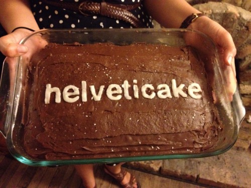
Ever since we watched the movie "Helvetica” in class, I have been noticing font choices everywhere – on billboards, advertisements, bags, TV commercials, and more. Until we watched this movie I never thought of how typefaces would affect the way we interpreted a message, however I know now that they play a significant role in the portrayal of content.
I have been keeping an open eye for different fonts, and (of course) I’ve noticed Helvetica is very common, but there are still other typefaces that I've seen work just as effectively.
These are two quotes from the movie I found particularly interesting.
"Typeface is your main weapon in modern communication."
-Neville Brody
Every day we are surrounded by advertisements and posters, unable to escape them. The majority of us probably see several different types of visual media daily just driving or walking to a destination. What the text says in this media is very important, not only what is stated, but the implications of the imagery as well. Neville Brody is saying that in modern communication, the text can imply so much meaning to the message being portrayed.
The company Caterpillar which provides machinery uses their font especially well in their logo. The letters are straight and bold, which makes it seem tough or hard to get by. This is exactly something a machinery company would want to portray through a logo.
The typeface is the FedEx logo is also bold and strong, not to mention the arrow between the ‘E’ and ‘X.’ The logo has a certain flow or movement to the design, it is a perfect example of imagery that can be implied through text.
The Baskin Robbins font has the playful, fun essence an ice cream and cake store would want. Another clever thing I found in this logo is the “BR” at the top spells out “31” with different colours, depicting the number of flavours the store has.
"And Helvetica maybe says everything, and that's perhaps part of its appeal."
-Jonathan Hoefler
Helvetica is seen everywhere, those living in big cities simply need to step outside of their door and the font is probably seen in several advertisements or signs.
Helvetica is often looked at as the best font, because sometimes it can say many different things. For example, Helvetica is used in almost any type of industry there is (music industries, car companies, retail stores and more).
The company Caterpillar (as mentioned earlier) provides heavy, strong machinery. They use Helvetica in their logo to show the bold, strong appeal of it. The way the letters are standing makes the word seem as if it is an impenetrable wall.
Bench uses Helvetica to seem contemporary, simple and casual.
The font has been proven to portray messages of all kinds. However I have not been learning about typefaces enough to decide whether I think it can say everything. Right now, though it is a great font, I don’t believe it is always perfect. I think experimenting with fonts is the best way to decide what one wants their product to portray.
F[a_, L_, r_, s_, t_] := Table[ {-(r + s*Cos[t])^n*Sin[n*a], (r + s*Cos[t])^n*Cos[n*a]}, {n, 0, L}] V := {{1.45631, 556, .995, .003}, {2.94712, 502, .998, .001}, {4.50891, 485, .9955, .0025}, {4.9367, 630, .997, .002}} Table[ ListAnimate[ Table[ Graphics[ Polygon[ F[Part[Part[V, G], 1], Part[Part[V, G], 2], Part[Part[V, G], 3], Part[Part[V, G], 4], t]], PlotRange -> 1, ImageSize -> 250], {t, 0, 2 Pi, 2 Pi/40}]], {G,1,4,1}