I'm secretly a ninja...but shhhhh.

Friday, June 22, 2012

Right Brain vs. Left Brain!


I was on StumbleUpon recently and came across this picture. The content is very interesting but I also really liked the way the picture was made. The layout is excellent, and the colours and fonts help get the message across as well. 
While I was reading this I was trying to think of what brain type I am. I find that I relate to both of them a lot. At the end of the day, I am much better at science and math than art, but I guess that's why I'm in this program - to develop my skills as a right-brain. 
Anyway, I just really liked this picture and thought I should share. 
Happy Summer!! 

LEGO Game of Thrones Intro!

It's pretty amazing what some people can create. This is a remake of the Game of Thrones intro - but is done with LEGO!


I thought this was so cool because the makers were able to get the kingdoms to build up just like in the original theme. They used a lot of aspects from the original theme and incorporated them into this one. What a great and creative idea!
When I was reading the Youtube comments I noticed that a lot of people were complaining about the music, however I thought the music was better customized, I don't think it would have the same affect if it wasn't. 
Season One Original:


Season Two Original: 


Hope you enjoyed this as much as I did. I just thought it was very creative and well done. 

Thursday, June 21, 2012

Website Portfolio!

Click here for my portfolio!

Website Reflection:

The purpose of my website is to showcase my work in a neat and professional style while still showing bits of my personality. By doing this I can link my work to anyone who wants to see it and I will always have a place to display any new work that I happen to create.

I used  http://www.wix.com/  as a template for my portfolio but edited my pictures with Adobe Photoshop CS4.

  • Printmaking: This piece is not my best from art class, however I wanted to include it because I can look back on it when I please and see how the similarities and differences between this work and my future work. 
  • Chinese Peacock: The Chinese Brush painting unit was very fun, and I think that this was my favourite piece from that unit. 
  • Orchid: I included the Orchid because I thought my brush strokes looked very delicate and professional. 
  • Skull Drawing: This was my favourite piece from the entire art unit, I loved my shading in it and the way I was able to use the elements and principles of design. 
  • Peculiar: My first typography experiment turned out very well. The font choice and layout of the word helped the meaning shine through. It was definitely my favourite piece from the semester. 
  • Peacock Feather: I enjoy this piece because of the contrast of colours between the background and feather. 
  • Shirt: I thought that the Shazaam shirt looked very clean, and although the direct message of my chosen article didn't show, I still thought the message I ended up trying to portray was shown.
  • Self Portrait: I think the self portrait is one of the most important projects in the tech portion of CyberARTS. There were many changes I would have made, but I still wanted to show it on my portfolio. 
I really enjoyed the overall simplicity of the layout that I chose and re arranged. I think the menu bar at the top with the fence in the background look very clean. I might've changed the background to have more white  space on my web portfolio. I'd also try harder in figuring out how to add sub pages which you can customize (more on that a little further down). 

Now that it is done, I really like my portfolio. I never thought that my work has ever stuck to one specific style, and I think this is really shown on my website. I wanted to put my self-portrait on my homepage for this reason. By putting my short description and self-portrait on the home page I was hoping it would give the viewer a heads up into what they may see. I've never stuck with one style and I've never really wanted to. (Or maybe I have and can't tell - you tell me!)

I had a lot of trouble when putting up this website. When I first began to make it, I tried to make customaizable sub pages, however when I'd make them, the sub pages would have the same albums on them. (For example: If I had portfolio in the menu bar, and art/tech in the drop down, every time I would try to change the template and/or photos on the sub pages they would end up being the same for each). I eventually decided that everything looked okay in the menu bar). I also was not able to upload my animations. I originally tried to add the pause/play button, but because I had not started my animations in ActionScript 3.0, it had not worked. After that, when uploading the Kinetic Typography to the website, the file was not scaled and I was not able to scale it. I know that the tech portion of CyberARTS will always have challenges that we need to overcome, and even though it's frustrating I don't really mind compromising a few aspects of my original designs. 

More Helvetica

Oooops. Another Helvetica post. Sorry. (Not sorry). 
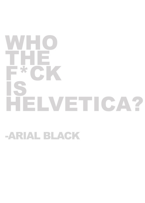
But seriously. LOOK AT ALL THE HELVETICA. 

Yup. Helvetica Cookie Cutters. Helvetica Cookie Cutters.


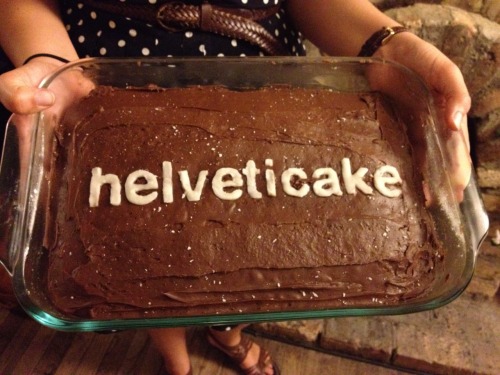
And now Helvetica Cake...
First, it's an amazing font, and now, you can eat it too! 


This I just thought was very funny:P 
Anyway, I thought I should share this because I realized how well known and popular this font is. Not only was it extremely influential, but it has been used countless times in every situation. 
Cheers for Helvetica! 


Helvetica Spottings at UofT


Back in May, me and one of my friends went to the University of Toronto for a 3-day business camp. Completely bored and curious during the breaks, I gave myself a little tour around the building we were in to pass the time. And behold, I found Helvetica. 


I found this very funny because the weekend before that weekend, I was at McMaster and their sign was in a modified version of Helvetica as well. 


I thought that the use of Helvetica in the building looked very clean and slick. It looked professional, fancy, and, well, it just looked good

I quickly took these with my phone, just so that I could blog about it. Thanks! 


Eye Drawing


While searching for tutorials to help improve my drawing, I came across this! I found this video appealing not only for the end product, but the way it's mesmerizing to watch and how the artist uses different tools to create the eye. I find myself watching this video repeatedly, I can't stop! 
The little notes he/she adds in are very helpful, at the beginning he says, "The quality of the lines is not important, but the accuracy of the shapes is crucial." This is something that I find screws me up a LOT when I'm drawing. Having disproportional shapes from the beginning sketches really affects your final product. 
I'm glad he/she shows us what kind of material he is using. I've always wanted to do some form of watercolour with pencil crayon, now I have a perfect reason to try. 
I'm also in love with this video because you can see the transformation from lights to darks as the image becomes closer to the final product. 
I will definitely try this in the near future. I think that trying new styles of art help you grow and develop as an artist. 
Have a  wonderful day! 

KInetic Typography Reflection


Title: Safe & Sound

Media: Adobe Flash CS4 & Adobe Illustrator CS4

Design Choices: I wanted to keep my Kinetic Typography simple, I used 3 fonts but mainly stuck with Calisto. I wanted my typography to look fragile and a little eerie as well. This also explains the choice of the old paper in the background.

Challenges & Solutions: The hardest part of my typography was definitely the chorus when I had the words Safe and Sound spell out in a script font. I had to take these words into Illustrator and slowly remove bits at the end until the whole word disappeared, and then convert each layer to a frame in Flash. Even though this became a lot of work, I was very happy with the end product.

Likes & Dislikes: To be honest, I don’t like my final product. Whenever I make something, I know that it’s not meeting my expectations. That being said, I don’t hate the whole thing. There are certain parts of the video that I thought stood out a lot. I could see my video progressing in quality as the video went on; therefore I thought the animations I did at the end were very effective and looked good. I put a lot of work into the chorus too, which I loved.
I’m not sure exactly what I would change.
Overall, I would look at the whole typography and re-do anything that doesn’t go with my concept. I found that the beginning and middle of the typography looked like I was just bringing words in for fun (which isn’t entirely false). I don’t want my work to look like that, I want to produce quality work and I know the only way to do that is to constantly practice. I don’t think I would make any revisions on this typography simply because it was my first one and I want to see how much I can improve in the future.
Generally, this project was a lot of fun, in fact the whole typography unit in general was probably one of the most interesting and valuable units I’ve learned in my whole career so far as a student.


Tuesday, June 19, 2012

How to create a Despicable Me Minion!


I recently found a tutorial on how to re-create the Dispicable Me minion using Photoshop and Illustrator!
While scrolling through this acrticle, I realized how difficult an animator's job can be. They need to plan out every little detail of thier character and once they are done planning, they need to create it on the computer.

The first outlines look somewhat like this:


Before is is put into Photoshop, this is the final Illustrator outline:


When you bring the image into Photoshop, the details and colours are finalized. All of these steps are very complicated if you want your minion to look exactly as the actual one. 
Basic colours: 

Here are some shots of the layer properties (ie. drop shadows, gradients, etc.)


If you're still interested, click here for the full tutorial! 


Transit of Venus-ing

On June 5th, I went with my friend and sister to the Ontario Science Centre to see the Transit of Venus with a bunch of other people with nerdy interests just like us.
When we were there, a lot of people set up cool devises that I will never know how to do. Some people have pinhole camera's and telescopes and things connected to laptops. It was pretty amazing. Here are a few pictures that I collected while I was there.


There were many more that I was not able to capture on camera, overall it was a wonderful experience! 
Oh, and here is a picture released by NASA:


CGPGrey


CGPGrey is by far one of my favourite "Youtube-ers." A lot of people think that Youtube is used just for looking at cute cats and various other animals, and while that is not entirely false, Youtube has an entire world of intelligent beings sharing their knowledge on the internet. 
CGPGrey is a perfect example of an icon who contributes to the artistic and knowledgeable utopia the internet can one day become. (Was that sentence grammatically correct?....I can't tell). He talks about certain topics while using images and animations that help to understand the topic at hand.
CGPGrey's videos contain great content. However what makes his videos amazing is the way he executes them to help the viewer retain more information. The visual effects he uses are make his videos some of the most descriptive and interesting I have ever seen. 
I find his videos very helpful, informative, and engrossing. I find that CGPGrey is able to capture the viewers attention within seconds, even if he is discussing dull topics. Maybe it's just me, but I think his videos are universal and anyone can watch them to gain more knowledge. 

Click here to check out his Youtube channel! 

Sticky Note Tetris Stop Motion Video


In all honesty, I think one of my favourite things to do is look at stop motion animations, and when I see some that only use very simple tools but still look professional, I get very happy!
I particularly like stop motions that take something ordinary and make it extraordinary. For example, the makers of this video took a video game that everyone knew about and mixed it up - giving the viewer something to relate to and something new that they'd want to see. The way the squares break apart and how the entire frame breaks and scatters on her at the end is very well done. I am very impressed with the overall planning and execution of this stop motion.

Monday, June 18, 2012

Portfolio Comparisons

Ben Kling:

In Ben Kling's portfolio, he added in some mouse over flash functions, which is not only fun but it gives the user control. Once he adds these in, the user's attention is immediately caught. There is nothing too distracting from the main point on the webpage and nothing looks out of place.
 Ben Kling also uses white space very effectively. He divides everything up using the negative area. If you click on the link, you'll see that there is a lot of empty space on the webpage. This works very well because he kept everything simple. He used large buttons and pictures to communicate where each link would take the viewer.
If you go and click on one of the tabs, a few of them are divided into sub-categories. This is also very helpful for the viewer to find what they are looking for. He never plays with the user's patience, everything on his website is clean and simple.
Overall, Ben Kling's web portfolio is easily maneuverable and simple, which is exactly what the viewer wants.

Ken Wilson:

Ken Wilson's website has too much going on to look good, and that is honestly the main reason I find it to be terrible. The colours make it worse too of course. Nothing on the webpage catches the viewer's eye immediately. The negative space is not used effectively at all, everything is too crowded and the overall quality of everything on the website is terrible. I find it difficult to look at. The website contains far too many page tabs. The ones at the bottom should be the focus, not the 'who/what/where/when/why/how.' The viewer has to think of what they want to see on the website, which is not the idea of a portfolio webpage.
The pictures are a big part of the problem as well. There is no unity on the site that ties everything in together. The text on each page is spaced and formatted differently, which causes for more uncertainty from the viewer.
Ken Wilson's website is not simple enough which makes it difficult for the viewer to find what they are looking for.

Typography in Flash


I found the link to this video again while I was looking for various Flash tutorials. Even though I had not used it, I wish I had! It is so much easier than what I had done for that writing affect. Though I guess that's just part of the learning process. If I ever need to to anything along those lines again, I know where to go! 


However, before I found that tutorial, I found this one. This was very  helpful because after I had brought the layers from Illustrator to frames in Flash, the placement and sizes were very awkward and they didn't look quite right. I am very happy I found this tutorial, it helped a lot with what I needed in my project. 

Sunday, June 17, 2012

The Periodic Table of Typefaces: Popular, Influential & Notorious


I was on StumbleUpon recently and came accross this - The Periodic Table of Typefaces. Besides being amazing and helpful, the maker of this tried putting similar typefaces in the same group/period, sort of like the  elements are grouped in the actual periodic table! Sans-Serif fonts are in the first two groups/periods. As you continue looking down, the typefaces become fancier and the script fonts are introduced. I thought the whole concept was very clever!
The creator tried to display the top 100 fonts used by designers. He included the creator of the typeface as well as the year it was made. It's interesting to see similar typefaces together thought they were made at completely different times. 
Anyway, just thought this was a good find. I highly encourage everyone to check it out. Click here for the website! 


F[a_, L_, r_, s_, t_] := Table[ {-(r + s*Cos[t])^n*Sin[n*a], (r + s*Cos[t])^n*Cos[n*a]}, {n, 0, L}] V := {{1.45631, 556, .995, .003}, {2.94712, 502, .998, .001}, {4.50891, 485, .9955, .0025}, {4.9367, 630, .997, .002}} Table[ ListAnimate[ Table[ Graphics[ Polygon[ F[Part[Part[V, G], 1], Part[Part[V, G], 2], Part[Part[V, G], 3], Part[Part[V, G], 4], t]], PlotRange -> 1, ImageSize -> 250], {t, 0, 2 Pi, 2 Pi/40}]], {G,1,4,1}