If you're in need of some humour, click here.
Demetri Martin is a comedian who enjoys transferring jokes to doodles. His doodles are refreshing and funny, but the one I liked in particular was "Self portrait from a distance." I began to wonder what it would look like if he expanded the distance even further, even passed the solar system. Would the doodle just be black? After all, the Universe has no edge, just infinite space that goes on and on and on and on. Humans are just one fraction of this fascinating universe, maybe one day astronomers will have found an 'edge' to the universe...in the mean time we continue to bask in the infinite-ness (I like making up words and phrases) of it.
I'm not sure how these doodles brought me to talking about the universe. Anyway, check them out, they're fun to look at. If you want to see more, click for his Twitter. He posts a lot of doodles there.
I'm secretly a ninja...but shhhhh.

Monday, May 14, 2012
Tuesday, May 8, 2012
Spotting Unusual Graffiti on the Internet
I guess the title says most of what this post contains. Here are some interesting words that have been illegally placed on buildings and other man made structures around the world:


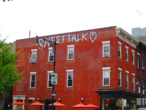
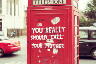

In my opinion, I love all three of these. Not only do they make me laugh, but they are not something I normally see. Most of the graffiti I see is tagging - which I personally hate.
I enjoy the graffiti that shows the artist has a lot of skill, not just the paint and the urge to vandalize a building. I guess these don't take much skill, however I enjoy them just as much as professional graffiti.
The problem I'm having is answering this question: Are these examples of Graffiti or just vandalism?
Are these pictures art or just words? Or both?
Just something to think about. I would love to hear some opinions!
The Evolution of the Coke Bottle

At first I wasn't too sure if Coca-Cola even existed in 1899, so I Google-d it. Turns out these were the exact dates when the designs of the bottles changed. Interesting, huh? I like the way you can see the shape/structure of the glass bottles become more and more modern-ized.
However my favourite part of this picture is the evolution of the logo imprint on the bottles. Faintly you can see the different fonts that changed through the years. I wanted to learn more on the different logos over time so I found this picture:
I realized that originally the logo was just the typeface reading "Coca-Cola," which is interesting because whenever I see think of Coca-Cola I always picture the bright red and white logo popping out at me.
I find it interesting how the company kept the script typeface until now, even after all typefaces became modernized and more "Helvetica-like." The typeface in this logo is called Spencerian Script, and it was developed around the 1840s. At the time, it was a very popular font - most formal writing was done in either this typeface or another similar to it.
Here is a coupon from 1888, interesting how the red from the newer logo isn't even present in this design.

I find this fascinating, I hope whoever reads this finds it interesting as well. Have a wonderful day! :)
Sunday, April 29, 2012
Skull Drawing

If I had to choose my favourite part of this drawing it would be my teacup handle. I thought the handle looked real and the shadows were perfect. I really concentrated on adding the darker shadow towards the end of the project and keeping it lighter in case I messed up. I am happy with the whole teacup, however I like the handle the best.
I had a lot of trouble with the left side of the skull because it had a lot of details and gaps on it. As time ran out I decided to simplify it instead of struggling and having it ruin the drawing. I am satisfied with what I did because I was still able to show the dark and light areas of the skull. I had a lot of trouble with not smudging the piece - especially when it came time to draw the background. Drawing the shadows of the cloth was very difficult for me, however without them the piece looked as if there was something missing.
The skull drawing project is my favourite from the year thus far. The movement of this drawing is nice because the cloth shadows at the top lead the eye into the centre of the drawing. The shadows are balanced and shapes create a dynamic repetition. Overall, I am happy with this work and glad we were able to do this project.
Tuesday, April 17, 2012
AGO Trip
At our recent AGO trip we were required to write about two pieces that made us think/had an emotional affect on us, one from our tech class and one from art.
Contemporary Art Exhibit:
Younger by Kori Newkirk was astonishing. It inspired me because I know these materials were items I would play with as a child, I'd wear them around my neck and wrists while not knowing they could make such wonderful art. I thought NewKirk's design was absolutely brilliant, she took ordinary objects and made them into something original and beautiful.
Canadian Art Exhibit:
The Bird Shop, St. Lawrence Street by Maurice Cullen was my selection for the lower level. This one was fairly similar to the pieces around it, but something about this painting caught my eye in a way no other painting on the floor did. Part of my attraction to this piece was seeing the shapes form the entire image, as I thought about this I also visualized what the process of painting this would be like. I thought of the shapes that would form the houses with the windows, doors and roofs. Also the outline of the figures and horses interested me. One thing that I also felt while looking at this piece was a type of nostalgia. It was like I felt nostalgic for a place I've never been to or seen in real life. The painter made the image so beautiful and calm that I would personally want to see where he set up his canvas to paint such a stunning scene.
Wednesday, March 7, 2012
Print Making

Our most recent project in art class was reduction printing. The theme was "Put a Bird on it!"
What print were you most satisfied with and why?
I found that there were three prints that really stood out to me. The one that was most popular among my classmates was print number three (above). I think this was the most satisfying print because I had a lot of trouble lining up the colours with each new colour, however number three looked professional in terms of the border and where the colours met up. The texture of the colours when printed on the paper was very consistent as well, forming unity which is visually pleasing.
What was the most difficult part of this assignment?
I found the entire assignment to be fairly difficult, because I had never really worked with print making or anything remotely close to what we were working with. My lack of experience made it very difficult to envision a final product, because I had a very vague picture of how these prints would look. However I think the most difficult part of the whole process was lining up the prints perfectly. After printing with the yellow (which looked great,) I was happy with the prints thus far, but when I used the red, the two colours were not in the same place on the paper, which began to stress me out. Eventually I began to learn different techniques which worked better when printing.
How did you use the elements and principles of design?
During the process work before the actual prints started, I did quite a few thumbnails in my sketchbook. When looking at my final sketch before moving on to carving and printing, there were several elements and principles that were noticeable. The background lines created movement, leading the eye throughout the design. Because all of the colours were bright and bold, I especially liked how they created contrast. I also think my piece was very balanced in terms of the colours and the positioning of the bird and flower. The black lines go through the background evenly and there is enough of the bold red on both sides to give it a smooth look. I used repetition and rhythm with the lines as well.
What is strong about your design?
Once the design was finished I found a few elements and principles that stood out to me. Unity was created through the texture: the consistency of the thickness of the paint in all three colours made the piece seem whole and completed. It drew in all the colours and layout to look like one piece, forming unity.
Describe one thing you would change about your design.
Though I haven’t really thought about this a lot, I would definitely consider adding more colours into the piece to define the bird and make it pop more so than the flower or the background. I find that because the black lines are so bold and defined, they take away from the bird, so I would definitely find a way to change that. Since the background was a problem, I would consider changing that, for example taking away the black lines and replacing them with a different colour or adding in a different background entirely.
Wednesday, February 29, 2012
Reflection on "Helvetica"
Ever since we watched the movie "Helvetica” in class, I have been noticing font choices everywhere – on billboards, advertisements, bags, TV commercials, and more. Until we watched this movie I never thought of how typefaces would affect the way we interpreted a message, however I know now that they play a significant role in the portrayal of content.
I have been keeping an open eye for different fonts, and (of course) I’ve noticed Helvetica is very common, but there are still other typefaces that I've seen work just as effectively.
These are two quotes from the movie I found particularly interesting.
-Neville Brody
The company Caterpillar which provides machinery uses their font especially well in their logo. The letters are straight and bold, which makes it seem tough or hard to get by. This is exactly something a machinery company would want to portray through a logo.
The typeface is the FedEx logo is also bold and strong, not to mention the arrow between the ‘E’ and ‘X.’ The logo has a certain flow or movement to the design, it is a perfect example of imagery that can be implied through text.
The Baskin Robbins font has the playful, fun essence an ice cream and cake store would want. Another clever thing I found in this logo is the “BR” at the top spells out “31” with different colours, depicting the number of flavours the store has.
"And Helvetica maybe says everything, and that's perhaps part of its appeal."
-Jonathan Hoefler
Helvetica is seen everywhere, those living in big cities simply need to step outside of their door and the font is probably seen in several advertisements or signs.
Helvetica is often looked at as the best font, because sometimes it can say many different things. For example, Helvetica is used in almost any type of industry there is (music industries, car companies, retail stores and more).
The company Caterpillar (as mentioned earlier) provides heavy, strong machinery. They use Helvetica in their logo to show the bold, strong appeal of it. The way the letters are standing makes the word seem as if it is an impenetrable wall.
Bench uses Helvetica to seem contemporary, simple and casual.
The font has been proven to portray messages of all kinds. However I have not been learning about typefaces enough to decide whether I think it can say everything. Right now, though it is a great font, I don’t believe it is always perfect. I think experimenting with fonts is the best way to decide what one wants their product to portray.
Subscribe to:
Posts (Atom)