At first I wasn't too sure if Coca-Cola even existed in 1899, so I Google-d it. Turns out these were the exact dates when the designs of the bottles changed. Interesting, huh? I like the way you can see the shape/structure of the glass bottles become more and more modern-ized.
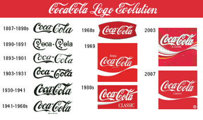
However my favourite part of this picture is the evolution of the logo imprint on the bottles. Faintly you can see the different fonts that changed through the years. I wanted to learn more on the different logos over time so I found this picture:

I realized that originally the logo was just the typeface reading "Coca-Cola," which is interesting because whenever I see think of Coca-Cola I always picture the bright red and white logo popping out at me.
I find it interesting how the company kept the script typeface until now, even after all typefaces became modernized and more "Helvetica-like." The typeface in this logo is called Spencerian Script, and it was developed around the 1840s. At the time, it was a very popular font - most formal writing was done in either this typeface or another similar to it.
Here is a coupon from 1888, interesting how the red from the newer logo isn't even present in this design.
I find this fascinating, I hope whoever reads this finds it interesting as well. Have a wonderful day! :)


No comments:
Post a Comment