I'm secretly a ninja...but shhhhh.

Showing posts with label Blog Post: Wild Card. Show all posts

Friday, June 22, 2012

Right Brain vs. Left Brain!


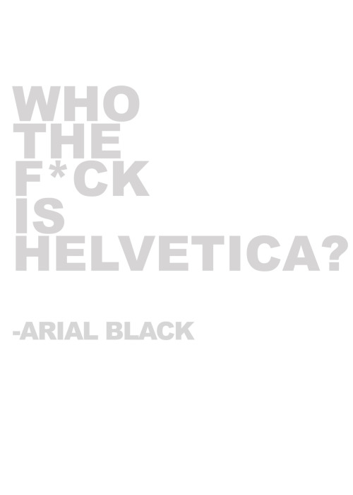
I was on StumbleUpon recently and came across this picture. The content is very interesting but I also really liked the way the picture was made. The layout is excellent, and the colours and fonts help get the message across as well. 
While I was reading this I was trying to think of what brain type I am. I find that I relate to both of them a lot. At the end of the day, I am much better at science and math than art, but I guess that's why I'm in this program - to develop my skills as a right-brain. 
Anyway, I just really liked this picture and thought I should share. 
Happy Summer!! 

Thursday, June 21, 2012

More Helvetica

Oooops. Another Helvetica post. Sorry. (Not sorry). 
But seriously. LOOK AT ALL THE HELVETICA. 

Yup. Helvetica Cookie Cutters. Helvetica Cookie Cutters.


And now Helvetica Cake...
First, it's an amazing font, and now, you can eat it too! 


This I just thought was very funny:P 
Anyway, I thought I should share this because I realized how well known and popular this font is. Not only was it extremely influential, but it has been used countless times in every situation. 
Cheers for Helvetica! 


Helvetica Spottings at UofT


Back in May, me and one of my friends went to the University of Toronto for a 3-day business camp. Completely bored and curious during the breaks, I gave myself a little tour around the building we were in to pass the time. And behold, I found Helvetica. 


I found this very funny because the weekend before that weekend, I was at McMaster and their sign was in a modified version of Helvetica as well. 


I thought that the use of Helvetica in the building looked very clean and slick. It looked professional, fancy, and, well, it just looked good

I quickly took these with my phone, just so that I could blog about it. Thanks! 


Tuesday, May 8, 2012

The Evolution of the Coke Bottle

I was on StumbleUpon when I came across this picture and I thought I should share it with the few lovely people who happen to pass by my blog. 
At first I wasn't too sure if Coca-Cola even existed in 1899, so I Google-d it. Turns out these were the exact dates when the designs of the bottles changed. Interesting, huh? I like the way you can see the shape/structure of the glass bottles become more and more modern-ized. 
However my favourite part of this picture is the evolution of the logo imprint on the bottles. Faintly you can see the different fonts that changed through the years. I wanted to learn more on the different logos over time  so I found this picture: 


I realized that originally the logo was just the typeface reading "Coca-Cola," which is interesting because whenever I see think of Coca-Cola I always picture the bright red and white logo popping out at me. 
I find it interesting how the company kept the script typeface until now, even after all typefaces became modernized and more "Helvetica-like." The typeface in this logo is called Spencerian Script, and it was developed around the 1840s. At the time, it was a very popular font - most formal writing was done in either this typeface or another similar to it. 
Here is a coupon from 1888, interesting how the red from the newer logo isn't even present in this design. 
I find this fascinating, I hope whoever reads this finds it interesting as well. Have a wonderful day! :)


F[a_, L_, r_, s_, t_] := Table[ {-(r + s*Cos[t])^n*Sin[n*a], (r + s*Cos[t])^n*Cos[n*a]}, {n, 0, L}] V := {{1.45631, 556, .995, .003}, {2.94712, 502, .998, .001}, {4.50891, 485, .9955, .0025}, {4.9367, 630, .997, .002}} Table[ ListAnimate[ Table[ Graphics[ Polygon[ F[Part[Part[V, G], 1], Part[Part[V, G], 2], Part[Part[V, G], 3], Part[Part[V, G], 4], t]], PlotRange -> 1, ImageSize -> 250], {t, 0, 2 Pi, 2 Pi/40}]], {G,1,4,1}