Saturday, May 19, 2012
Wednesday, May 16, 2012
Su Blackwell: Book Sculptures!
Su Blackwell is a very unique artist who sculpts using books. She depicts scenes from stories in a three dimensional sculpture using the paper and words from the book itself.
Here are my two personal favourites:
Little Red Riding Hood
Alice in Wonderland
She also created a set for the theatrical production of "The Snow Queen" at The Rose Theatre in the United Kingdom:
I'm always mind boggled whenever I find an artist like this. I just keep wondering where the inspiration would come to make something like this and how one would begin with the execution. It would take several days of planning - imagine wondering how much you need to cut out and where the shadows would land and the different layers. What would be in the background and in the foreground. I think Little Red Riding Hood is one of my favourites because she has lighting included in it. She also framed it in a glass case. It gave it the 'frozen, snow globe' effect (as I like to call it).
The British artist's work is enchanting and inspiring because of several aspects. She uses stories to make figures tell their stories. Her talent combines different arts together - the writing influences the charming visual sculptures which is made out of the physical story itself. Reading expands the mind and creates wonderful images in the brain. Su Blackwell re created these images in an interesting way using the same material that created the physical story.
Making something similar to one of these would be insane. I may just try it one day.
Monday, May 14, 2012
Demetri Martin
If you're in need of some humour, click here.
Demetri Martin is a comedian who enjoys transferring jokes to doodles. His doodles are refreshing and funny, but the one I liked in particular was "Self portrait from a distance." I began to wonder what it would look like if he expanded the distance even further, even passed the solar system. Would the doodle just be black? After all, the Universe has no edge, just infinite space that goes on and on and on and on. Humans are just one fraction of this fascinating universe, maybe one day astronomers will have found an 'edge' to the universe...in the mean time we continue to bask in the infinite-ness (I like making up words and phrases) of it.
I'm not sure how these doodles brought me to talking about the universe. Anyway, check them out, they're fun to look at. If you want to see more, click for his Twitter. He posts a lot of doodles there.
Tuesday, May 8, 2012
Spotting Unusual Graffiti on the Internet
I guess the title says most of what this post contains. Here are some interesting words that have been illegally placed on buildings and other man made structures around the world:
In my opinion, I love all three of these. Not only do they make me laugh, but they are not something I normally see. Most of the graffiti I see is tagging - which I personally hate.
I enjoy the graffiti that shows the artist has a lot of skill, not just the paint and the urge to vandalize a building. I guess these don't take much skill, however I enjoy them just as much as professional graffiti.
The problem I'm having is answering this question: Are these examples of Graffiti or just vandalism?
Are these pictures art or just words? Or both?
Just something to think about. I would love to hear some opinions!
The Evolution of the Coke Bottle
I was on StumbleUpon when I came across this picture and I thought I should share it with the few lovely people who happen to pass by my blog.
At first I wasn't too sure if Coca-Cola even existed in 1899, so I Google-d it. Turns out these were the exact dates when the designs of the bottles changed. Interesting, huh? I like the way you can see the shape/structure of the glass bottles become more and more modern-ized.
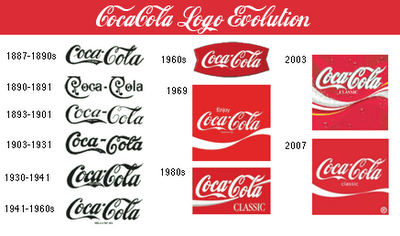
However my favourite part of this picture is the evolution of the logo imprint on the bottles. Faintly you can see the different fonts that changed through the years. I wanted to learn more on the different logos over time so I found this picture:

I realized that originally the logo was just the typeface reading "Coca-Cola," which is interesting because whenever I see think of Coca-Cola I always picture the bright red and white logo popping out at me.
I find it interesting how the company kept the script typeface until now, even after all typefaces became modernized and more "Helvetica-like." The typeface in this logo is called Spencerian Script, and it was developed around the 1840s. At the time, it was a very popular font - most formal writing was done in either this typeface or another similar to it.
Here is a coupon from 1888, interesting how the red from the newer logo isn't even present in this design.
At first I wasn't too sure if Coca-Cola even existed in 1899, so I Google-d it. Turns out these were the exact dates when the designs of the bottles changed. Interesting, huh? I like the way you can see the shape/structure of the glass bottles become more and more modern-ized.
However my favourite part of this picture is the evolution of the logo imprint on the bottles. Faintly you can see the different fonts that changed through the years. I wanted to learn more on the different logos over time so I found this picture:

I realized that originally the logo was just the typeface reading "Coca-Cola," which is interesting because whenever I see think of Coca-Cola I always picture the bright red and white logo popping out at me.
I find it interesting how the company kept the script typeface until now, even after all typefaces became modernized and more "Helvetica-like." The typeface in this logo is called Spencerian Script, and it was developed around the 1840s. At the time, it was a very popular font - most formal writing was done in either this typeface or another similar to it.
Here is a coupon from 1888, interesting how the red from the newer logo isn't even present in this design.
I find this fascinating, I hope whoever reads this finds it interesting as well. Have a wonderful day! :)
Subscribe to:
Comments (Atom)


