Name(s) of Company: 1.) Green Feather
2.) Ailuropoda melanoleuca ( panda in latin)
3.)jessicapatel Book Publishing
What kind of Company are you?
I am creating a company that does book design, I choose the cover of the book and the layout of the pages inside.
Style/Personality:
My company is going to be very professional and having refined taste, but at the same time, we are very reliable and knowledgeable. We will get whatever needs to be done, done. Although we are the Book Designers, we will go by the theme of the book (e.g. Children's book, Romance, etc.).
Animal:
Panda Bear
Characteristics: Panda Bears are known to represent knowledge, they are cute and cuddly but at the same time they are very strong mentally and physically. I thought that this would be a good animal for my company because it shows knowledge and that what needs to get done will get done.
Other Book Designers (The competition):
http://www.fionaraven.com/
http://www.janicephelps.com/default.htm
http://www.longfeatherbookdesign.com/
Friday, September 24, 2010
Wednesday, September 22, 2010
Art Critique-"Sloop Nassau" by Homer

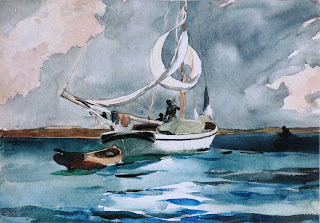
Hey world, for a CyberARTS assignment, we were told to write an Art Critique. For my choice of painting, I chose "Sloop, Nassau" by Homer. I chose this painting because I felt very calm when I saw it, and I felt the water colour portrayed the painting perfectly. For this critique, I will be describing the Imitationalist, Formalist, and Emotionalist qualities.
Imitationalism:
This painting looks very real, one can clearly see the scenery the artist is trying to show. The boat, the water, the land and the cloudy sky are all shown with enough detail that the interpreter knows exactly what it is. One can see the canoe attached to the sailboat and the people on the boat. Overall, the painting is shown in great detail, which makes it very easy to tell what the artist wants to show.
Formalism:
The artist of this painting has used the elements and principles of design in an intriguing way. When one first lays eyes on this painting, they are immediately drawn to the center where the sailboat is, this is because it is the focal point and it contrasts with the rest of the painting. The boat is mostly white, but when one sees he rest of the painting, there are more light colours here and there, creating balance. The colours on this painting are all cool colours, this creates balance and unity because it makes the painting fit together as a whole. In conclusion, this painting has all the elements and principles of design and uses them very well.
Emotionalism:
When looking at this piece of art, I feel very relaxed and serene, because whenever I'm by waves/water, I feel very laid back, like nothing in the world matters anymore. This is expressed with the way the lines create movement in this painting.
Rhythm Assignment


These pieces work in different ways because one gives the effect of more movement than the other. The 2nd piece creates more of an illusion than the first one; this is because of where the lines are placed and the thicknesses of them. In the first one, it seems like a very bold rhythm, because the lines are thicker. With the second one, you can see a more steady rhythm, one where you know more about what’s happening. I believe that both of these pieces work in their own way, but the second one, I believe has more of an illusion effect, which is something that most people would enjoy more than the first piece. However, despite this they are still both pleasing to the eye.
Thursday, September 16, 2010
Subscribe to:
Comments (Atom)